
Open Play Console on a listing that ships to phones only and the tablet section is empty. Nothing blocks publishing. Google asks for a minimum of two screenshots across device types, and two phone shots clear that bar. The gap is quieter than a rejection: Play has nothing to show on a tablet, a Chromebook, or a foldable opened flat, so the listing that looks finished on a phone looks abandoned on the device sitting on someone's kitchen counter.
Google's help page is explicit about the large-screen case. For Chromebook and tablets, you can add a minimum of four screenshots, uploaded between 1,080 and 7,680 px, in 16:9 landscape or 9:16 portrait. Four is twice the number needed to publish at all, and it is also the threshold that decides whether your app is eligible for the sections of Play that show apps in a large format built from screenshots.
By the Numbers: Play's Device-by-Device Screenshot Rules
Pulled from Google's Play Console help on 10 November 2026:
- 8 — screenshots allowed per supported device type.
- 7 — device families with their own slots: phones, tablets (7-inch and 10-inch listed separately), Chromebooks, Android TVs, Wear OS watches, Android Automotive OS cars, and Android XR headsets.
- 2 — screenshots required to publish a store listing at all, across different device types.
- 4 — minimum for the Chromebook and tablet slots, and the minimum for app eligibility in large-format recommendations.
- 1,080 px — floor for large-screen screenshots; the same section tops out at 7,680 px.
- 320 px / 3,840 px — general minimum and maximum dimension, with the long side no more than twice the short side.
- 1080×1920 or 1920×1080 — the 9:16 and 16:9 minimums Google names for recommendation eligibility. Games need three, apps need four.
- 20% — the share of the image a tagline should cover, at most.
- 140 characters — the alt-text limit Google recommends per screenshot.
What our own Search Console data says
We pulled the Search Console export for screencraftapp.com before writing this: 4–8 November 2026, 5 days, 171 impressions and 2 clicks. The query dimension returned 37 query rows covering 81 of those impressions; the rest sit under Search Console's anonymity threshold. 6 size-related queries — led by play store screenshot size (10 impressions) — collected 21 impressions at average positions between 39.8 and 82.0.
This is a short window: the property's data begins 4 November 2026, and low-volume queries are withheld. Treat it as direction, not a benchmark.
Two and Four: The Gap That Doesn't Show Up as an Error
The publish rule is generous. Google's requirement list says you must provide a minimum of two screenshots across different device types, in JPEG or 24-bit PNG with no alpha, minimum dimension 320 px, maximum 3,840 px. A phone-only listing with two 1080×1920 shots passes every line of that.
The large-screen guidance is a different number. "For Chromebook and tablets, you can add a minimum of 4 screenshots to demonstrate your in-app experience," the same help page reads. Then the eligibility clause: some Play surfaces show groups of recommended apps in a large format using screenshots, and to be considered, apps must provide at least four screenshots at 1080 px or higher, shaped 16:9 (minimum 1920×1080) or 9:16 (minimum 1080×1920). Games get a slightly lower bar at three.
So a phone-only listing is legal and, in the places that matter for discovery, thin. Google states the same thing in policy language elsewhere: reach a broader potential user base by including screenshots on all supported device platforms, in multiple orientations. That sentence sits in the store-listing policy guidance, not in a design blog.
What Each Slot Actually Asks For
The requirements are not uniform, which is why teams that treat "screenshots" as one asset miss half of them.
Phones. 320 px minimum, 3,840 px maximum, JPEG or 24-bit PNG without alpha. The long side can't exceed twice the short side. Two of these publish a listing.
Tablets (7-inch and 10-inch) and Chromebooks. At least four per slot, 1,080 to 7,680 px, 16:9 in landscape or 9:16 in portrait. Google adds a warning that belongs in every design review: exclude additional text that is not part of the core app experience, because it can get cut off on Play homepages at certain screen sizes.
Wear OS. At least one screenshot that shows the current version, interface only, no device frames, no added text, graphics or backgrounds, 1:1 aspect ratio, minimum 384×384 px.
Android TV. At least one TV screenshot before you can publish, plus a TV banner. TV screenshots appear only on TV devices.
Android Automotive OS. If you provide car screenshots at all, you must supply at least two portraits at 800×1280 and two landscapes at 1024×768, rendered on a generic system image rather than a specific vehicle.
Android XR. Four to eight screenshots, PNG or JPEG, up to 8 MB each, 8:5 ratio, 3840×2400 recommended with 1920×1200 as the floor.
The 1024 × 500 feature graphic is the other Play asset a tablet pass tends to skip: Play refuses to publish a listing without it, most listings never show it, and it carries its own safe zone and banned-word list. The Play feature graphic specs, decoded covers the geometry and the featuring data behind it.
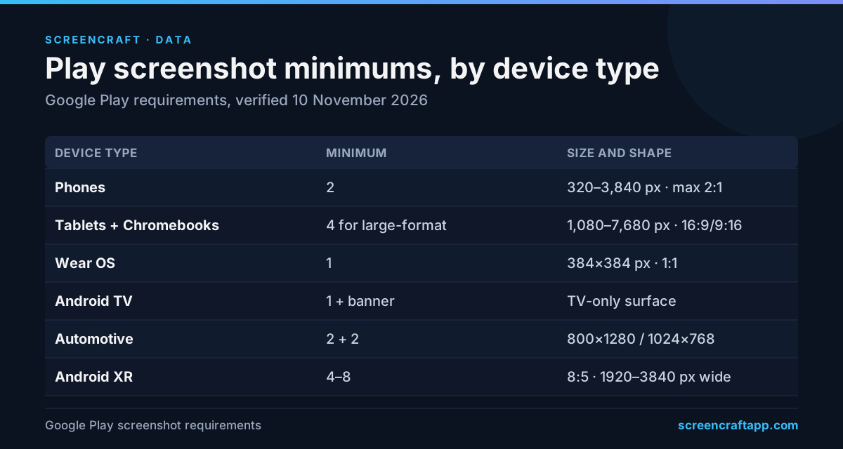
The short version for a design brief. The bullets above carry the exceptions.
Why 2026 Makes the Empty Slot Expensive
Through Android 16, an app could opt out of the orientation and resizability rules on large screens. Android 17 removed that exit. In a 13 February 2026 post, Google's Android team wrote that API level 37 "removes the developer opt-out for orientation and resizability restrictions on large screen devices (sw > 600 dp)" and that apps targeting it "must be capable of adapting to a variety of display sizes." Android 17 shipped on 16 June 2026.
The consequence for listings is direct. A year ago, a phone app could still open letterboxed or locked to portrait on a tablet, and phone screenshots were a fair description of what a tablet user would get. That is no longer true for apps on the current target. The app now fills the window, with a rail, a two-pane layout, or a wider grid. Phone-only screenshots now advertise an experience the app has stopped delivering, and the tablet slot that would have corrected the impression is the one left empty.
The Ratio Question: 9:16 Phone, 16:9 Large Screen
Almost every Play phone set is built at 1080×1920, which is 9:16. Google's large-screen guidance asks for 16:9 landscape or 9:16 portrait — the same 9:16 shape, but at a tablet's pixel count. That means the aspect ratio is not the hard part. The content is.
A 9:16 tablet set is not a phone set with bigger fonts. If the app shows a navigation rail on a 10-inch screen, the screenshot should show the rail. If it shows two columns of content, the screenshot should show both. Google's guidance puts it plainly: screenshots must demonstrate the actual in-app experience, and the first three should prioritize UI.
There is a second ratio question worth settling before design starts. Google's general rule is a ratio test, not a fixed shape: the long side can't be more than twice the short side. A 4:3 export at 2048×1536 passes that test. So does a 5:8 export at 1600×2560, the shape many tablet mockups use. Both can sit in the slot. Neither matches the 16:9/9:16 form Google names for the recommendation rows, which is the difference between "accepted" and "eligible for the large format".
If the recommendation surfaces matter to you, design at 1920×1080 or 1080×1920 and put tablet UI inside it. If you only need a correct store page, any ratio inside the 2:1 test works — but check it against the export sizes we list before you commit, because the phone and tablet slots don't share a canvas.
The Two Pixel Ranges on Google's Page
Google's page gives two maximums that don't agree. The requirement list caps any screenshot at 3,840 px. The large-screen section says to upload between 1,080 and 7,680 px. That is a documented conflict, not a reading error.
The safe move is to stay at or below 3,840 px on the long side. A 2560-px tablet export satisfies both readings. A 7,000-px export satisfies one and contradicts the other, and there is no upside: extra pixels buy a slower upload and a larger file, not a sharper listing.
The other number to respect is the floor. A phone screenshot scaled up to tablet size looks exactly like what it is. Google's guidance tells publishers not to include screenshots that are blurry, distorted or pixelated, and not to stretch or compress images. Upscaling a 1080-wide capture to 2560 wide is both.
Building the Tablet Set From the Phone Set You Already Have
The work is smaller than it looks if the app already adapts. A sequence that holds up:
- Pick the canvas first. 1920×1080 landscape or 1080×1920 portrait for the 16:9/9:16 route; a 4:3 or 5:8 canvas if you only need the slot filled. Decide before anyone opens a design file.
- Capture the tablet layout, not the phone layout. Run the app on a tablet emulator or a foldable, open the screens that carry the value, and capture there. If the tablet build looks worse than the phone build, that is a product finding, not a screenshot problem.
- Leave the edges quiet. Play crops for homepages at certain screen sizes. Keep text and key UI away from the outer 5–8% of the canvas so a crop doesn't eat the headline.
- Keep the tagline under a fifth of the image. Google's 20% figure is a good ceiling; a headline that fills the top third is the most common reason a tablet screenshot reads as an ad.
- Write the alt text as you export. 140 characters or fewer, describing the screen rather than the picture: "Two-pane inbox with the message list on the left." Screen-reader users get the description, and so does anyone whose image failed to load.
- Upload at least four, in the order you want them read. Eight is the ceiling per device type. The first three carry the UI; the rest can carry depth, integrations or proof.
- Localize the text-bearing images. Google asks for separate screenshots per language where the image contains text, and says the metadata policy applies to every translation. A set that ships in English only is a set that ships in one market.
ScreenCraft exports Play phone (1080×1920), 7-inch (1200×1920) and 10-inch (1600×2560) sets from one design, which removes the layout duplication. The ratio decision above still belongs to you.
Failure Modes We See in Tablet and Chromebook Sets
One tablet screenshot. It fills the slot and misses the four-screenshot minimum, so it can't qualify for the large-format rows. Four is the number to hit, not one.
Phone UI in a tablet frame. The frame is the tell. Google discourages device imagery on Play screenshots anyway — it dates quickly and can alienate users on other hardware — so a phone-shaped mockup on a tablet slot signals the wrong thing twice.
A stretched capture. 1080-wide art pushed to 2560 wide is visibly soft on a 10-inch screen, and Google's guidance explicitly rules out stretched or pixelated images.
Promotional copy. "Download now", "Best app", "#1", "New", "Sale" and price claims are called out by name in Google's screenshot guidance. Testimonials and rating claims are in the same list. Taglines are allowed; sales pitches are not.
Text that only works in English. Google asks for localized text-bearing screenshots, and says the metadata policy applies to every translation. A translated headline can run longer than the English source, so a tagline that fills the frame in English is the first one to overflow once it is translated.
TV and Wear treated as afterthoughts. A TV screenshot plus banner is a publishing gate for TV apps, and Wear requires a 1:1 image at 384 px or more with no frames and no added text. These are cheap to produce and expensive to discover at submission.
The Bottom Line
Publishing on Play takes two screenshots. Being seen on the surfaces that use screenshots takes four, at 1,080 px or more, in a shape Google recognizes. With Android 17 forcing apps to adapt to large screens, the tablet and Chromebook slots are now the difference between a listing that describes the app and one that describes last year's version.
Before the next submission: check that each device family you support has at least four screenshots, confirm the long side is at or under 3,840 px, keep taglines under 20% of the frame, and write alt text for every image. The Play-specific rules and the App Store comparison cover the rest of the store-by-store differences.
Sources and Data
- Google Play Console Help, "Add preview assets to showcase your app" — screenshot counts, device types, pixel ranges, ratio rules, Wear OS, TV, Automotive and XR requirements. https://support.google.com/googleplay/android-developer/answer/9866151 — fetched 10 November 2026.
- Google Play Console Help, "Store listing and promotion policy guidance" — screenshots on all supported device platforms and in multiple orientations. https://support.google.com/googleplay/android-developer/answer/13393723 — fetched 10 November 2026.
- Android Developers Blog, "Prepare your app for the resizability and orientation changes in Android 17" (13 February 2026) — removal of the large-screen opt-out at API level 37. https://android-developers.googleblog.com/2026/02/prepare-your-app-for-resizability-and.html — fetched 10 November 2026.
- Android Developers Blog, "Android 17 is here" (16 June 2026) — release date for Android 17. https://android-developers.googleblog.com/2026/06/Android-17.html — fetched 10 November 2026.
Help pages change without notice; the pixel figures above reflect the pages as fetched on 10 November 2026. This is a summary of published store requirements, not legal advice.